Pivot Tables
A friend of mine has asked me to post on Pivot Tables as they just recently learned about them, and I thought it was a great idea. So you might be asking, "What are Pivot Tables?" Essentially, pivot tables allow you to quickly summarize large data sets (well, semi-large as Excel only allows you to a little over 65,000 records) in 1 or 2 or ... etc. dimensional ways. For example, if you have a set of detailed sales records with dates in one column, sales region in another column, and sales dollars in a third column you could create a report to summarize sales by Quarter by Sales Region to see how your sales staff is doing. You might have months down the left hand side and Sales Regions across the top, with the intersection of these two items representing the sales for that month, that region. To help enhance this post, I've posted a sample file that you can download here that contains daily stock prices for 3 stocks (Yahoo, Comcast and Google) for all of 2004. You'll have to download the file as a comma-separated file (csv) and then open it in Excel. Or, you could just copy and paste into Excel and then do a "Data | Text to Columns..." and use a comma as the delimiter.
Now that we have a baseline to work with, we can start to think about analysis. For example, what if we were analyzing the above three companies (I'm not sure why we would compare THESE 3, but you can use your imagination), and we would like a monthly analysis on the high price for the month, low price for the month, and average price for the month for all 3 stocks. We don't need each separate analysis at once, but we want it to be very simple to see whichever one we want at a moments notice. Pivot tables make this very easy.
To begin, we need to know what month the prices fall in. It just so happens that I recently wrote an article on extracting information from dates, so we know this will be easy. First, note that the stock prices each have a date in column 2. To figure out what month it's in programatically, we'll use Excel's 'MONTH' formula. Begin by typing in cell D2 the formula =MONTH(B2), and then copy this down to cell D599 (w/ quick keys: Ctrl-C cell D2, Ctrl-G D599, Ctrl-Shift-Up, ). As one last step, let's give the month field a header in cell D1 (we'll call it "Month"). This is necessary for the pivot table. Now that we have whatever month the stock price is in, we'll move on to the real work: the pivot table.
To create a pivot table, simply highlight the data you would like to include in the new table, and then go to Data | Pivot Table. You will be asked where to select the data from, so we obviously want to select it from an Excel list. You can leave the default on for what kind of report to create (a Pivot table, NOT a pivot chart). Hit next, and on the next screen make sure that the data highlighted is the entire list of data that we created (should be from cell A1:D599). After you ensure that the entire list is selected, hit next and then hit finish. By default, a new worksheet should have been created with a placeholder for data items. This is where we define what kind of analysis we would like to perform.
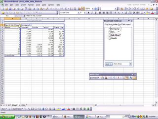
For this example, I would like to see each company's stock by month. The easiest way to do this is to have the companies across the top, and the months down the left hand side. We'll start with the companies: drag the "Company" field from the "Pivot Table Field List" (see picture below).

Now that you have the companies across the top, we'll drag the "Month" field to the left where it says "Drop Row Fields Here". We can now add the numbers by dragging the field "Adj. Close*" to the "Drop Data Items here" section. By default, the data will represent the totals for the cross sections - but we want to see the average or the high price, etc. so we have to change this ... the sum of prices for the month of May doesn't really make sense. To do this, double click on the "button" (for lack of a better word - it looks like a button) in the upper left corner of the pivot table called "Sum of Adj. Close*". This brings up a box where you can change the name, but more importantly the function that is performed on the data. For now, we'll choose "Average" but feel free to experiment with "Max", "Min" or anything else you're interested in exploring.
That's it! If you've gotten this far, you should have a working pivot table as well as a pretty good understanding of how they work. If you wanted to get a little fancy, click on the "Format Report" button on the Pivot Table toolbar and choose a formatting option so it looks a little nicer. I also eliminated the "Grand Totals" for the columns and rows (go to "Pivot Table | Table Options" on the Pivot Table toolbar and uncheck the first two boxes) as totals don't make sense in this instance.
One last thought: click on the "down arrows" in the table and check and uncheck items at your whim. It will eliminate (or add) items from (to) the pivot table like a filter might.
As you can see, pivot tables can be a very powerful tool once you master the basics. Read the help menu or search Google if you want to learn more. Hope you liked the article!
Now that we have a baseline to work with, we can start to think about analysis. For example, what if we were analyzing the above three companies (I'm not sure why we would compare THESE 3, but you can use your imagination), and we would like a monthly analysis on the high price for the month, low price for the month, and average price for the month for all 3 stocks. We don't need each separate analysis at once, but we want it to be very simple to see whichever one we want at a moments notice. Pivot tables make this very easy.
To begin, we need to know what month the prices fall in. It just so happens that I recently wrote an article on extracting information from dates, so we know this will be easy. First, note that the stock prices each have a date in column 2. To figure out what month it's in programatically, we'll use Excel's 'MONTH' formula. Begin by typing in cell D2 the formula =MONTH(B2), and then copy this down to cell D599 (w/ quick keys: Ctrl-C cell D2, Ctrl-G D599
To create a pivot table, simply highlight the data you would like to include in the new table, and then go to Data | Pivot Table. You will be asked where to select the data from, so we obviously want to select it from an Excel list. You can leave the default on for what kind of report to create (a Pivot table, NOT a pivot chart). Hit next, and on the next screen make sure that the data highlighted is the entire list of data that we created (should be from cell A1:D599). After you ensure that the entire list is selected, hit next and then hit finish. By default, a new worksheet should have been created with a placeholder for data items. This is where we define what kind of analysis we would like to perform.
For this example, I would like to see each company's stock by month. The easiest way to do this is to have the companies across the top, and the months down the left hand side. We'll start with the companies: drag the "Company" field from the "Pivot Table Field List" (see picture below).

Now that you have the companies across the top, we'll drag the "Month" field to the left where it says "Drop Row Fields Here". We can now add the numbers by dragging the field "Adj. Close*" to the "Drop Data Items here" section. By default, the data will represent the totals for the cross sections - but we want to see the average or the high price, etc. so we have to change this ... the sum of prices for the month of May doesn't really make sense. To do this, double click on the "button" (for lack of a better word - it looks like a button) in the upper left corner of the pivot table called "Sum of Adj. Close*". This brings up a box where you can change the name, but more importantly the function that is performed on the data. For now, we'll choose "Average" but feel free to experiment with "Max", "Min" or anything else you're interested in exploring.
That's it! If you've gotten this far, you should have a working pivot table as well as a pretty good understanding of how they work. If you wanted to get a little fancy, click on the "Format Report" button on the Pivot Table toolbar and choose a formatting option so it looks a little nicer. I also eliminated the "Grand Totals" for the columns and rows (go to "Pivot Table | Table Options" on the Pivot Table toolbar and uncheck the first two boxes) as totals don't make sense in this instance.
One last thought: click on the "down arrows" in the table and check and uncheck items at your whim. It will eliminate (or add) items from (to) the pivot table like a filter might.
As you can see, pivot tables can be a very powerful tool once you master the basics. Read the help menu or search Google if you want to learn more. Hope you liked the article!

0 Comments:
Post a Comment
<< Home